|
In Search of Bigfoot and Facebook Photo Quality
Don't Print That Facebook Photo!When I share photos on Facebook, I frequently choose a maximum pixel size of 600 or 720. Occasionally I use 1024, but that's rare. If the photo I'm sharing is also posted on my personal photography page, I always include a direct link to view it on my website too. I've been asked more than once, why do it this way? Many phones and tablets are now reaching resolutions that compete with traditional computers, and 600px might seem like a very small photo size. And it is. I encourage people to click the links I share and view the images on my personal website. Why? The answer boils down to quality. I'm not talking about the photography subjects we all see on Facebook. There are many stunning and beautiful shots by many talented photographers. Rather, this is all about the digital quality that Facebook uses to display them. To be straight with you, Facebook photo quality sucks. They compress the photos to the point of drastic degradation and it's quite obvious when you know what to look for. Here's a prime example.
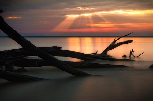
The above photo I recently shared on my Facebook page. It gathered quite a lot of "likes" and "shares", which I'm always happy to see. But the image viewed on Facebook is of dramatically less quality than the image viewed on my website.
How Bad Is It?Let's take a look at three areas in particular and do a comparison of what Facebook displays vs what my website displays.
Starting in the bottom left, in the darker area where the log disappears into the water. You can clearly see the pixelated blocks in what should be smooth water. And if you look at the edge of the log you can see plenty of compression artifacts.
Now let's move to the right side, where those sticks are coming out of the water. This is one of the worst areas to me. That pattern of sticks is one of the focal points of the shot. It has interesting shapes (one stick almost looks like a little alligator head) and high contrast and viewers eyes are drawn to that area of the photo. But if you look at the Facebook version on the right side you can clearly see the edges of the sticks are very "dirty", there's a jaggedness to all the edges.
Moving to the last spot in the sky, the difference isn't as noticeable, but it can be seen. This is another focal point of the image, where the rays of sunlight come streaming through the clouds. In Facebook's version on the right, you can make out boxy patterns in the sky, especially if you look at the right edge of the ray of light.
You can toggle between the two images below to see the comparison for yourself. The differences are especially clear in the water in the bottom half of the shot. 
Why does this matter?It matters for 2 primary reasons, at least to me. First, don't trust the photos you see on Facebook as quality representations of the actual shot. If you want an image as a print or for use in a digital project, ALWAYS contact the original artist first. This is not only required due to copyright, but you'll get a higher quality copy too. And secondly, NEVER, EVER use Facebook images as a source to generate a print. Physical prints should always be created from the original digital files. Facebook's photo compression becomes even more noticeable when you print a shot, especially if you print it large like an 8x10. So just don't do it. If you're a follower of my page on Facebook, now you know why I usually provide links to view the same image on this website. Next time, if you want to see a higher quality copy displayed at full screen, please be sure to click the link :) Comments
There are no comments on this post. Be the first one to comment using the form below.
Add Comment
|
Topic List
adventures
business
calendar
copyright
digital editing
equipment
event
facebook
free
google
internet
lightroom
microsoft
opinion
philosophy
photoclub
photography
photoshop
poetry
presentation
promotion
software
technique
technology
Search
Posts By Date
Recent Posts
Latest Photos
|


